 Web designers have no choice but to stay up to date with the latest digital trends and fads, but experienced web designers know how to spot the difference. If you’re a business owner, then chances are you had a website designed years ago when the web was a very different place. Unfortunately, that means your website now looks dated. And since most web designers agree you have just 10 seconds to make an impression on visitors to your site, that’s bad news for anyone trying to drum up new leads or online sales.
If you’re creating a new website for 2015 or 2016, or redesigning a dated website, then here are the top three graphic design trends you need to know about. So before you book graphic design services, learn to speak the language.
1. Flat Design
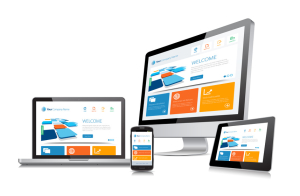
User Interface Design (UI) is now the new standard among any top web design company. It’s a more intuitive form of design based on optimizing the experience of your visitors. Seems obvious enough, right? Unfortunately, in 2015, that means you have to optimize for people on desktop PCs, laptops, smartphones (with various size screens), tablets, and whatever gadget they invent next.
To help ensure a seamless experience across devices, quality graphic design services now focus on flat design. In short, it’s a style of design that rejects any artificial attempt to create a 3D perspective using old graphic design standbys like drop shadows, gradients, or texture. To get a quick idea of what we mean, check out Google’s newlogos.
2. Circular Logo Design
You’ve probably noticed this trend by now. Across a huge array of websites and apps, the best graphic design services are now favoring circular logos. From Google+ to Instagram to Tinder, countless sites are now using circular cropping for logo design, avatars, profile pictures, and more. This is part and parcel of the flat design trend, and if you start looking for it, we’re certain you’ll see these circular icons popping up all over the web.
3. Size Matters
Our final trend is a bit of a contradiction. Silicon Valley’s heavy hitters are trying to ensure mobile pages and apps load as quickly as possible, and that means decreasing file sizes to speed up page load time. After all, about four in 10 users will ditch a site if it takes more than three seconds to load.
At the same time, the average internet user has access to wi-fi that gets faster every year. That means graphic design services are finally feeling free to use larger, higher-definition photos. Let’s call it medium definition. Simultaneously, those designers are experimenting with different fonts and graphics, some of which appear hand drawn. In general, we’re seeing a lot more photos — and bigger photos — on popular websites. This year, 70% of digital marketing services said they planned to increase their use of visual assets.
A few years ago, graphic design services were going nuts for something called “dynamic logos.” Again, think of Google, which periodically updated its logo for holidays and special events. Your average logo design company was obsessed with the idea. In reality, this never really went everywhere, and even Google itself stripped down its own logo to a simpler design.
However, we’re confident the three graphic design trends listed above are going to remain hugely important in 2016 web design. Ignore them at your peril.


